Driving Interaction: Volvo’s new grid view led to an 8% CTR lift
Driving Interaction: Volvo’s new grid view led to an 8% CTR lift
Client:
Volvo
Industry:
Automotive
My role:
UX Designer
Time frame:
03/2025 - 04/2025
Overview
In the automotive world, purchasing decisions rarely happen in a single visit. A brand’s website plays a crucial supporting role, it’s where users explore options, compare models, and gather the information they need before ever stepping into a showroom.
Volvo’s existing vehicle listing page used a traditional list layout, showing one car at a time. While clean and familiar, we believed this format might be limiting. Users had to scroll extensively to get a sense of the full offer - and in a category where comparison is everything, that friction could mean lost interest.
Goal
The goal of this project was to test and measure which layout: list or grid would drive higher user engagement and conversions. We wanted to understand how different presentation styles impact user behaviour and identify the solution that makes it easier for users to explore, compare, and take action.
My role
I was the lead UX researcher and designer on this project. I was responsible for identifying user experience challenges, designing the new layout concept, and validating it through A/B testing and behavioral data analysis.
Preparing AB test
We ran a 4-week A/B test using PostHog, an analytics tool that allowed us to track user behavior in real time.
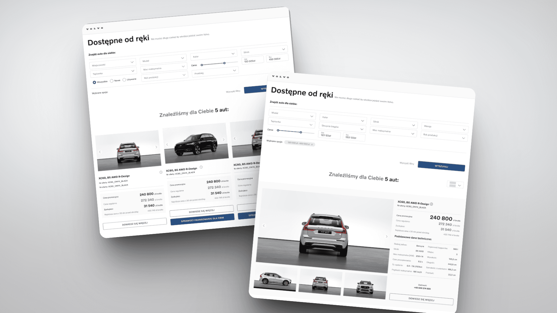
Variant A featured the existing list layout, showing one vehicle at a time.
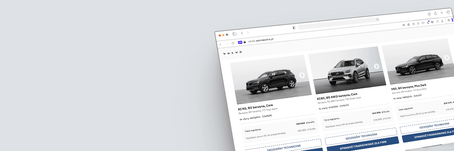
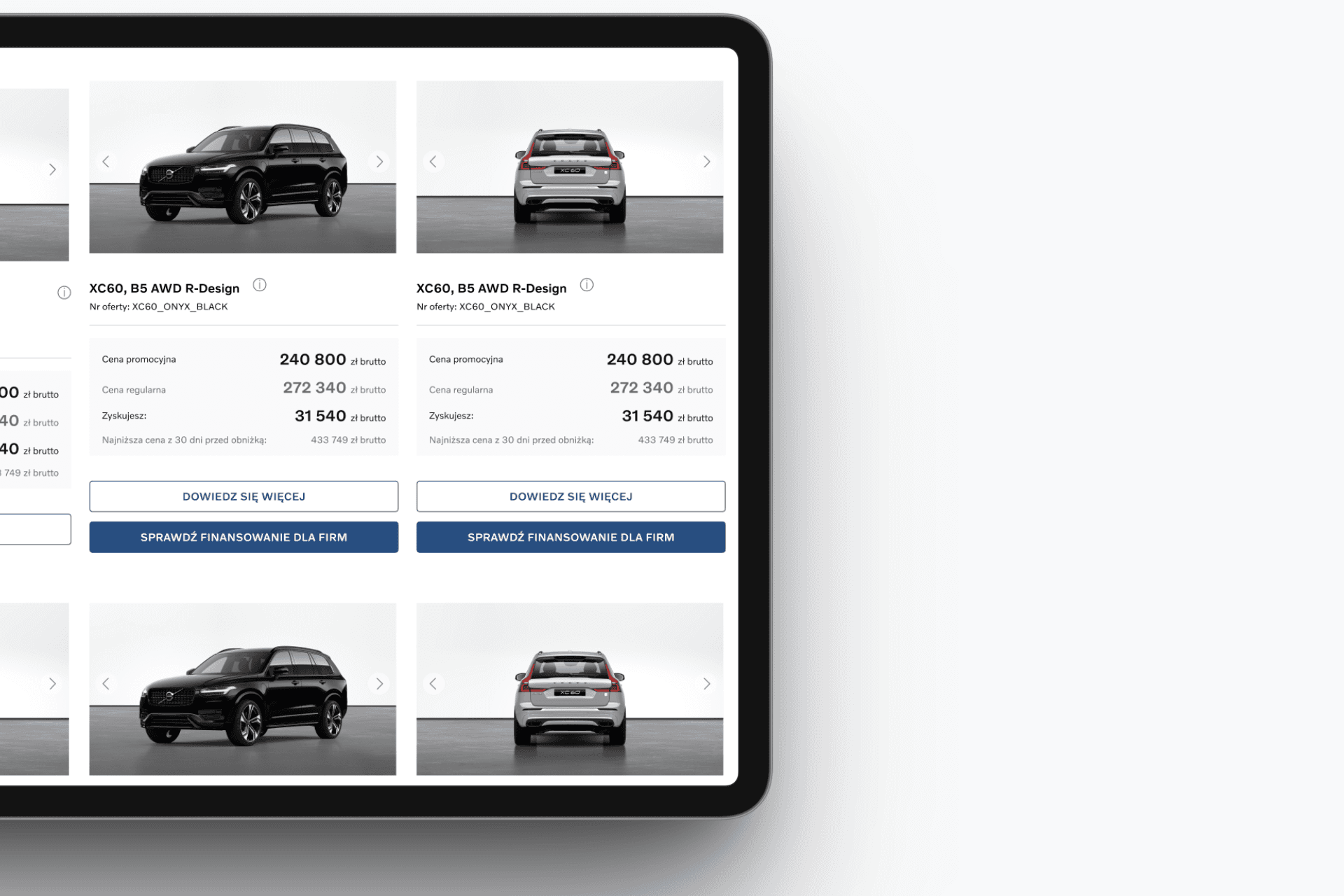
Variant B introduced the new grid layout, displaying three vehicles at once in the initial viewport.
We focused on key engagement metrics to understand how each layout influenced user behavior:
Click-through rate to model detail pages
Time spent on page
Pages viewed per session
Form submissions (e.g. contact, financing inquiries)
Interaction with the view toggle feature
We focused on key engagement metrics to understand how each layout influenced user behavior:
Click-through rate to model detail pages
Time spent on page
Pages viewed per session
Form submissions (e.g. contact, financing inquiries)
Interaction with the view toggle feature
Design process
Design new listing layout
Before jumping into testing, I designed
a new grid layout that aligned with Volvo’s existing design system. The new design displayed three vehicle models in a row, giving users a broader overview
at a glance. This made the browsing experience more visual, scannable, and comparison-friendly, reducing the need for excessive scrolling and helping users spot relevant options faster.
Design new listing layout
Before jumping into testing, I designed a new grid layout that aligned with Volvo’s existing design system. The new design displayed three vehicle models in a row, giving users a broader overview at a glance. This made the browsing experience more visual, scannable, and comparison-friendly, reducing the need for excessive scrolling and helping users spot relevant options faster.
What did the data told us?
Sometimes, all it takes is a simple layout change to shift how people interact with a product. When we introduced a new grid layout on Volvo's listing page showing three cars at a time instead of one we wanted to see whether users would engage differently. And they did.
The grid version generated an 8% higher click-through rate to individual model pages, and users spent 6% more time on the page. On top of that, they browsed an average of 1.3 more subpages per session. We also noticed higher engagement with filters and sorting tools, suggesting that the grid made it easier for users to compare and explore.
Interestingly, the view toggle feature turned out to be more than a minor UX detail: 51% of users in the grid version and 46% in the list version used it, proving that giving users control over how content is displayed isn’t just appreciated - it’s expected. This experiment confirmed that layout isn’t just about aesthetics, it can drive real, measurable behaviour.
UX outcomes
S-how more, faster
Giving users a broader overview up front made exploration easier and more intuitive.
Let users stay in control
The popularity of the view switcher highlighted how important personalization and flexibility are in modern UX.
Visual structure matters
The grid layout encouraged deeper exploration - users interacted more with filters and browsed more content.
Small UI changes = big impact
This wasn’t a redesign. Just a smart tweak to layout and hierarchy - and it led to real behavioral shifts.
UX outcomes
Show more, faster
Giving users a broader overview up front made exploration easier and more intuitive.
Let users stay in control
The popularity of the view switcher highlighted how important personalization and flexibility are in modern UX.
Visual structure matters
The grid layout encouraged deeper exploration - users interacted more with filters and browsed more content.
Small UI changes = big impact
This wasn’t a redesign. Just a smart tweak to layout and hierarchy - and it led to real behavioral shifts.
Final thoughts
Sometimes, great UX isn’t about flashy redesigns - it’s about quietly removing the friction that gets in the way. By rethinking how people explore cars online, we made it easier for them to browse, compare, and connect with the right model - faster and with less effort.
The result? A simple layout change, grounded in real user behavior, led to an 8% boost in engagement. It’s proof that small, thoughtful design decisions can drive big impact and that’s the kind of win we love to chase.
Client:
Volvo
Industry:
Automotive
My role:
UX Designer
Time frame:
03/2025 - 04/2025
Overview
In the automotive world, purchasing decisions rarely happen in a single visit. A brand’s website plays a crucial supporting role, it’s where users explore options, compare models, and gather the information they need before ever stepping into a showroom.
Volvo’s existing vehicle listing page used a traditional list layout, showing one car at a time. While clean and familiar, we believed this format might be limiting. Users had to scroll extensively to get a sense of the full offer - and in a category where comparison is everything, that friction could mean lost interest.
Goal
The goal of this project was to test and measure which layout: list or grid would drive higher user engagement and conversions. We wanted to understand how different presentation styles impact user behaviour and identify the solution that makes it easier for users to explore, compare, and take action.
My role
I was the lead UX researcher and designer on this project. I was responsible for identifying user experience challenges, designing the new layout concept, and validating it through A/B testing and behavioral data analysis.
Final thoughts
Sometimes, great UX isn’t about flashy redesigns - it’s about quietly removing the friction that gets in the way. By rethinking how people explore cars online, we made it easier for them to browse, compare, and connect with the right model - faster and with less effort.
The result? A simple layout change, grounded in real user behavior, led to an 8% boost in engagement. It’s proof that small, thoughtful design decisions can drive big impact and that’s the kind of win we love to chase.
Driving interaction:
Volvo’s new grid view led to an 8% CTR lift
Client:
Volvo
Industry:
Automotive
My role:
UX Designer
Time frame:
02/2025 - 04/2025
Overview
In the automotive world, purchasing decisions rarely happen in a single visit. A brand’s website plays a crucial supporting role, it’s where users explore options, compare models, and gather the information they need before ever stepping into a showroom.
Volvo’s existing vehicle listing page used a traditional list layout, showing one car at a time. While clean and familiar, we believed this format might be limiting. Users had to scroll extensively to get a sense of the full offer - and in a category where comparison is everything, that friction could mean lost interest.
Goal
The goal of this project was to test and measure which layout: list or grid would drive higher user engagement and conversions. We wanted to understand how different presentation styles impact user behaviour and identify the solution that makes it easier for users to explore, compare, and take action.
My role
I was the lead UX researcher and designer on this project. I was responsible for identifying user experience challenges, designing the new layout concept, and validating it through A/B testing and behavioral data analysis.
Design process
Design new listing layout
Before jumping into testing, I designed
a new grid layout that aligned with Volvo’s existing design system. The new design displayed three vehicle models in a row, giving users a broader overview at a glance. This made the browsing experience more visual, scannable, and comparison-friendly, reducing the need for excessive scrolling and helping users spot relevant options faster.
Preparing AB test
We ran a 4-week A/B test using PostHog, an analytics tool that allowed us to track user behavior in real time.
Variant A featured the existing list layout, showing one vehicle at a time
Variant B introduced the new grid layout, displaying three vehicles at once in the initial viewport.
We focused on key engagement metrics to understand how each layout influenced user behavior:
Click-through rate to model detail pages
Time spent on page
Pages viewed per session
Form submissions (e.g. contact, financing inquiries)
Interaction with the view toggle feature
What did the data told us?
Sometimes, all it takes is a simple layout change to shift how people interact with a product. When we introduced a new grid layout on Volvo's listing page showing three cars at a time instead of one we wanted to see whether users would engage differently. And they did.
The grid version generated an 8% higher click-through rate to individual model pages, and users spent 6% more time on the page.
On top of that, they browsed an average of 1.3 more subpages per session. We also noticed higher engagement with filters and sorting tools, suggesting that the grid made it easier
for users to compare and explore.
Interestingly, the view toggle feature turned
out to be more than a minor UX detail: 51% of users in the grid version and 46% in the list version used it, proving that giving users control over how content is displayed isn’t just appreciated - it’s expected. This experiment confirmed that layout isn’t just about aesthetics, it can drive real, measurable behaviour.
UX outcomes
Show more, faster
Giving users a broader overview up front made exploration easier and more intuitive.
Let users stay in control
The popularity of the view switcher highlighted how important personalization and flexibility are in modern UX.
Visual structure matters
The grid layout encouraged deeper exploration - users interacted more with filters and browsed more content.
Small UI changes = big impact
This wasn’t a redesign. Just a smart tweak
to layout and hierarchy - and it led to real behavioral shifts.
Final thoughts
Sometimes, great UX isn’t about flashy redesigns - it’s about quietly removing the friction that gets in the way.
By rethinking how people explore cars online, we made it easier for them to browse, compare, and connect with the right model - faster and with less effort.
The result? A simple layout change, grounded in real user behavior, led to an 8% boost in engagement. It’s proof that small, thoughtful design decisions can drive big impact and that’s the kind of win we love to chase.
Let’s connect