Heurostic-driven redesign for Toyota's claim system

Client:
Toyota
Industry:
Automotive
My role:
UX Designer
Time frame:
02/2024 - 05/2024
Overview
Back-office systems often get less attention than the ones customers see, but that doesn’t make them any less important. Toyota’s internal tool for handling insurance claims was powerful, but it had become messy and hard
to use.
Teams using it every day had to deal with cluttered screens, confusing layouts, and inconsistent design choices. The system still worked, but it wasn’t working well for the people using it.
Goal
To improve the usability and efficiency of Toyota’s internal insurance claims system by applying UX heuristics to streamline key workflows, reduce cognitive load, and eliminate interface friction.
My role
In this project, I served as the UX designer responsible for improving the usability of Toyota’s internal insurance claims system. Working within strict constraints, no time for user research, a pre-defined design system,
and a need for quick turnaround
Design process
Key screens I was analysed:
Lack of element hierarchy
Non-intuitive placement of buttons
Unclear messages
Duplication of elements
Lack of consistency
Key screens I was analysed:
Lack of element hierarchy
Non-intuitive placement of buttons
Unclear messages
Duplication of elements
Lack of consistency
Heuristic evaluation
& system audit
With no time and resources for user research, the project began with a thorough heuristic evaluation of the existing system.
I conducted a detailed audit of key modules assessing the interface against established UX principles like consistency, visibility, and user control. This allowed me to identify patterns
of usability friction, such as visual clutter, unclear hierarchies, and duplicated
or poorly placed actions.
Key screens I was analysed:
Lack of element hierarchy
Non-intuitive placement of buttons
Unclear messages
Duplication of elements
Lack of consistency

Pain point identification
Through close analysis of each screen,
I documented specific usability issues, including:
non-intuitive layouts,
overwhelming forms, and
navigation elements that confused rather than guided.
I paid special attention to elements like button behaviour, step visibility, and how information was structured focusing on areas that created cognitive overload
or interrupted task flows.
Constraint-driven redesign
With a fixed design system and a clear directive not to rebuild from scratch, the redesign was focused and pragmatic.
I applied UX best practices to restructure content, improve layout clarity, and reduce friction ensuring that every change was feasible within the given limitations. Key interventions included introducing better visual hierarchy, improving form structure, reducing redundant elements, and ensuring consistent interaction patterns.

source: https://www.interaction-design.org/
Iteration through interface refinement
Since user testing wasn’t possible within the project constraints, I relied on established UX principles and collaborative internal reviews to guide the design process. Each decision was made with a focus on clarity, efficiency, and reducing user friction - ensuring the interface better supported day-to-day tasks.
To validate and refine the solutions, I also presented the work to insurance industry specialists familiar with the system. Their practical insights helped shape final adjustments and ensured the redesign aligned with real user needs and workflows.

Cooperation with developer
The final stage of the process involved close collaboration with the software engineer to ensure the proposed changes were feasible and aligned with technical constraints. We reviewed the redesigned components together, clarified interactions, and made small adjustments where needed to support smooth implementation. This ongoing dialogue helped bridge the gap between design and development, ensuring that the final result stayed true to the UX vision while fitting seamlessly into the existing system.
Main changes and their impact on usability
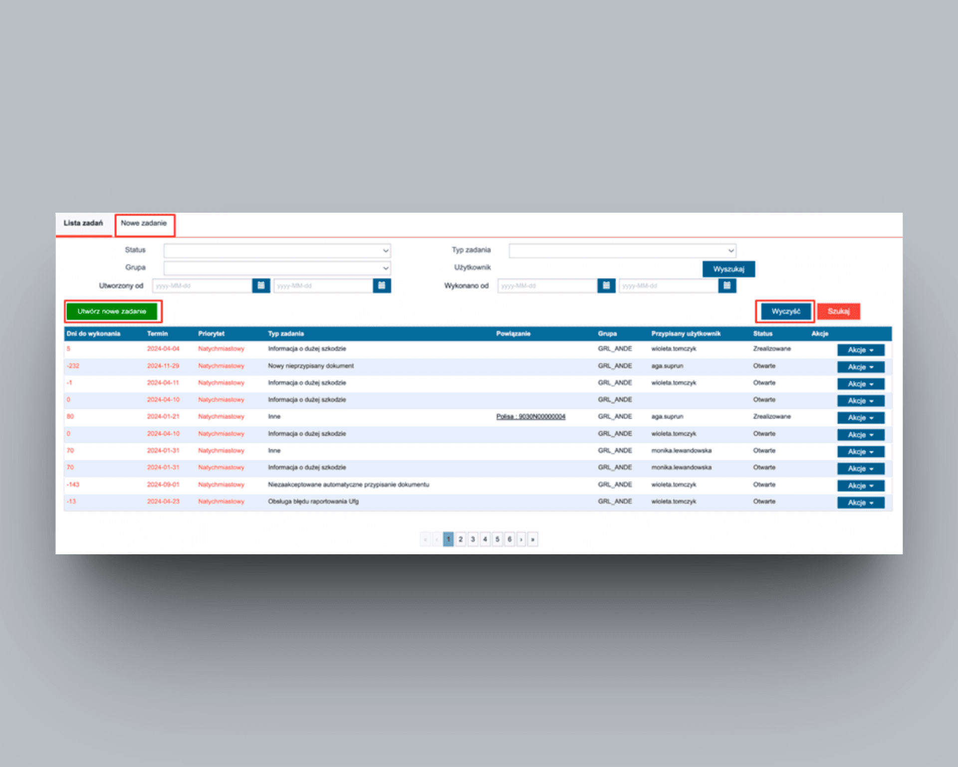
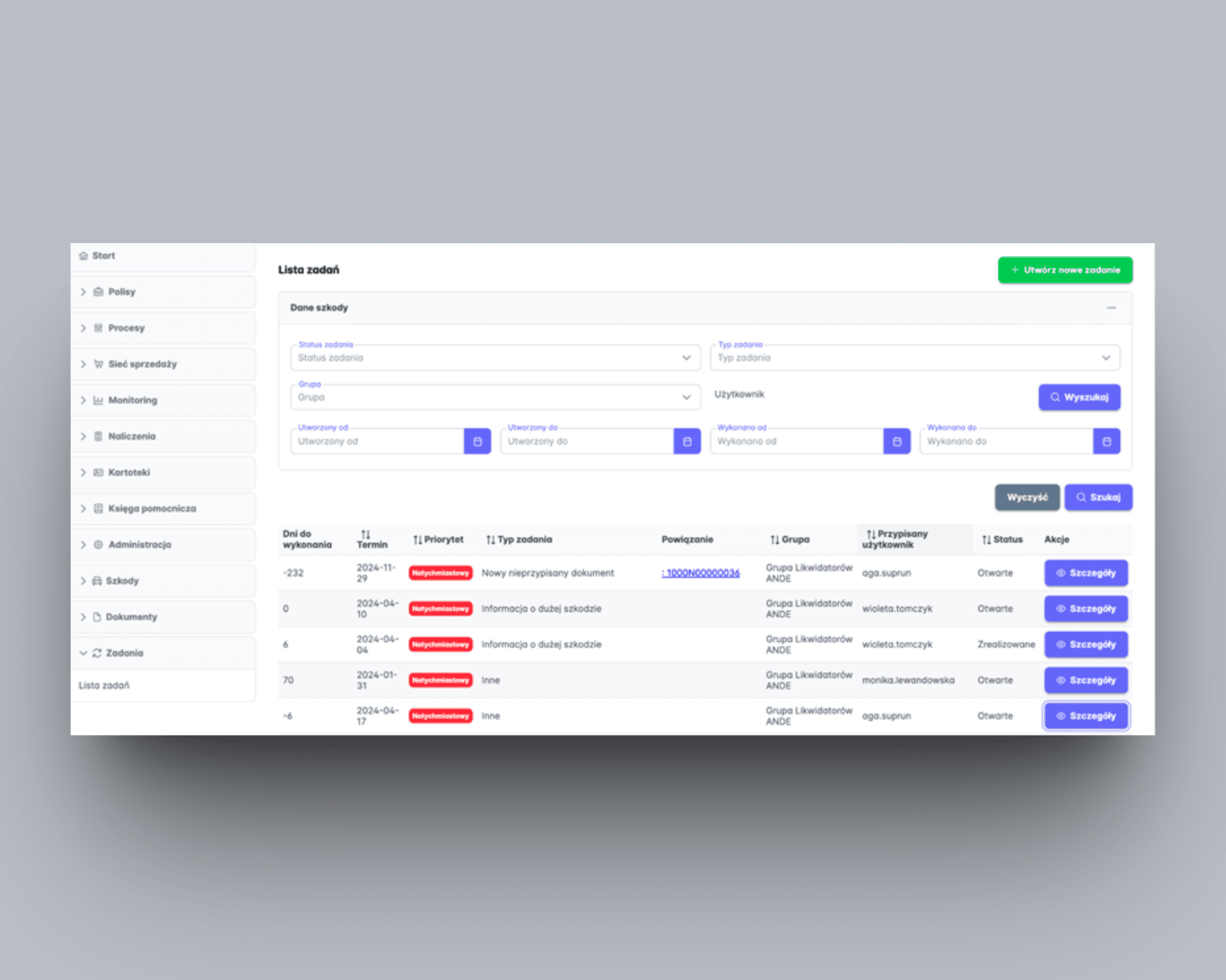
Task list view
Identified Issues (violated heuristics):
Visibility of system status
The original layout lacked a clear visual hierarchy. The "Create new task" button appeared at the same level as "Clear" and "Search" - all placed directly under the filters. This made it unclear which actions applied to which parts of the interface.
Aesthetic and minimalist design
The "Clear" button was always active, even when filter inputs were empty, leading to confusion when nothing changed after clicking it.
User control and freedom
Additionally, a tab labeled "New task" linked to the same screen as the "Create New Task" button, duplicating functionality in
a way that was not obvious to users.
Implemented solutions:
Removed the “New task” tab eliminates redundancy and prevents users from wondering why there are two ways to reach the same place.
Relocated the “Create new task” button to the top-right corner visually separates task creation from filter-related actions, reinforcing hierarchy and clarity.
Adjusted the “Clear” button behavior: ensures it’s only active when filter inputs contain values, setting clearer expectations and reducing confusion.


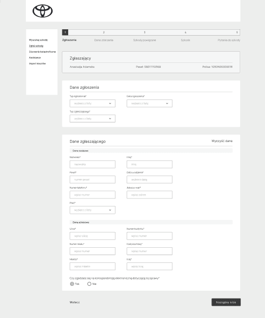
Claim submission
Identified Issues (violated heuristics):
Visibility of system status
The form consisted of five steps, but only the name of the first step was visible, leaving users unsure about what to expect next.
Aesthetic and minimalist design
The large number of input fields appeared all at once without any categorization, making the experience feel overwhelming.
User control and freedom
Moreover, there was no option to cancel and return to the previous screen, trapping users in the flow with no way out.
Implemented solutions:
Step names added to the stepper and centered on the screen gives users
a clear overview of the form structure and what lies ahead, improving orientation and reducing anxiety.
Input fields divided into logical section makes the form easier to scan and complete by grouping related information, reducing cognitive load.
“Cancel” option introduced - allows users to back out of the form flow
at any point, giving them more control over their actions.

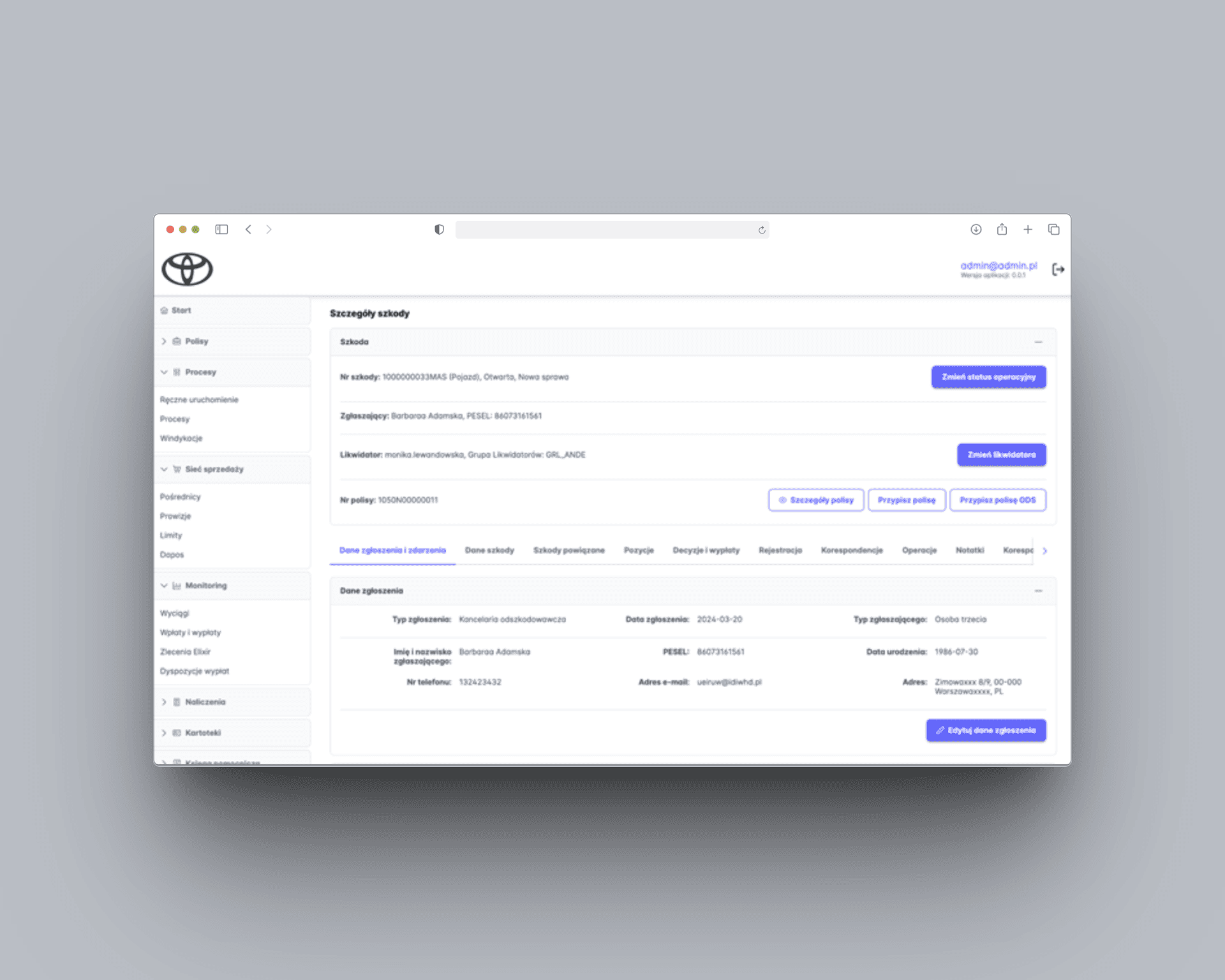
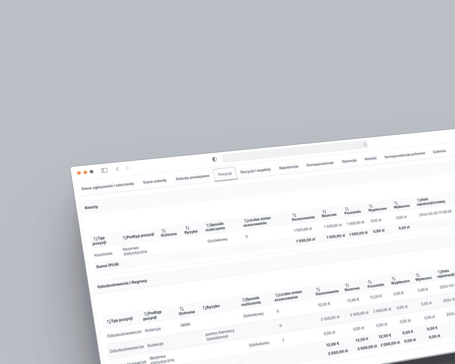
Claim detail view
Identified Issues (violated heuristics):
Recognition rather than recall
The screen lacked a clear visual hierarchy, making it difficult for users to scan the content and quickly locate relevant information. According to the heuristic, the system should minimize memory load by keeping information visible and accessible. In this case, poor layout and clutter forced users to remember where things were or search for them manually.
Aesthetic and minimalist design
The use of tabs led to overcrowding, when there were too many, they wrapped into
a second line, cluttering the interface and reducing usability.
Implemented solutions:
Key event details moved to the top
of the screen with inline edit options:
makes the most critical information immediately visible and actionable, reducing the need to search or remember where to find it.
Tabs replaced with a horizontal slider component prevents visual overflow on screens with many sections and preserves screen real estate, leading to a cleaner, more usable layout.
Content visually grouped with dividers and logical structure supports faster scanning and comprehension, especially for users managing multiple claims or working under time pressure.


Heuristic-driven redesign for Toyota’s claims system
Heuristic-driven redesign for Toyota’s claims system
Client:
Toyota
Industry:
Automotive
My role:
UX Designer
Time frame:
02/2024 - 05/2024
Client:
Toyota
Industry:
Automotive
My role:
UX Designe
Time frame:
02/2024 - 05/2024
Overview
Back-office systems often get less attention than the ones customers see, but that doesn’t make them any less important. Toyota’s internal tool for handling insurance claims was powerful, but it had become messy and hard to use.
Teams using it every day had to deal with cluttered screens, confusing layouts, and inconsistent design choices. The system still worked, but it wasn’t working well for the people using it.
Goal
To improve the usability and efficiency of Toyota’s internal insurance claims system by applying UX heuristics to streamline key workflows, reduce cognitive load, and eliminate interface friction.
To improve the usability and efficiency of Toyota’s internal insurance claims system by applying UX heuristics to streamline key workflows, reduce cognitive load, and eliminate interface friction.
My role
In this project, I served as the UX designer responsible for improving the usability of Toyota’s internal insurance claims system. Working within strict constraints, no time for user research, a pre-defined design system, and a need for quick turnaround
In this project, I served as the UX designer responsible for improving the usability of Toyota’s internal insurance claims system. Working within strict constraints, no time for user research, a pre-defined design system, and a need for quick turnaround
Design process
Heuristic evaluation
& system audit
With no time and resources for user research, the project began with a thorough heuristic evaluation of the existing system.
I conducted a detailed audit of key modules assessing the interface against established UX principles like consistency, visibility, and user control. This allowed me to identify patterns of usability friction, such as visual clutter, unclear hierarchies, and duplicated
or poorly placed actions.
Key screens I was analysed:
Lack of element hierarchy
Non-intuitive placement of buttons
Unclear messages
Duplication of elements
Lack of consistency
Design process
Heuristic evaluation
& system audit
With no time and resources for user research, the project began with a thorough heuristic evaluation of the existing system. I conducted a detailed audit of key modules assessing the interface against established UX principles like consistency, visibility, and user control. This allowed me to identify patterns of usability friction, such as visual clutter, unclear hierarchies, and duplicated or poorly placed actions.
Key screens I was analysed:
Lack of element hierarchy
Non-intuitive placement of buttons
Unclear messages
Duplication of elements
Lack of consistency
Pain point identification
Through close analysis of each screen,
I documented specific usability issues, including:
non-intuitive layouts,
overwhelming forms, and
navigation elements that confused rather than guided.
I paid special attention to elements like button behaviour, step visibility, and how information was structured focusing on areas that created cognitive overload or interrupted task flows.
Pain point identification
Through close analysis of each screen, I documented specific usability issues, including:
non-intuitive layouts,
overwhelming forms,
and navigation elements that confused rather than guided.
I paid special attention to elements like button behaviour, step visibility, and how information was structured focusing on areas that created cognitive overload o
r interrupted task flows.
Constraint-driven redesign
With a fixed design system and a clear directive not to rebuild from scratch, the redesign was focused and pragmatic. I applied UX best practices to restructure content, improve layout clarity, and reduce friction ensuring that every change was feasible within the given limitations. Key interventions included introducing better visual hierarchy, improving form structure, reducing redundant elements, and ensuring consistent interaction patterns.
Iteration through interface refinement
Since user testing wasn’t possible within the project constraints, I relied on established UX principles and collaborative internal reviews to guide the design process. Each decision was made with a focus on clarity, efficiency, and reducing user friction - ensuring the interface better supported day-to-day tasks.
To validate and refine the solutions, I also presented the work to insurance industry specialists familiar with the system. Their practical insights helped shape final adjustments and ensured the redesign aligned with real user needs and workflows.
Cooperation with developer
The final stage of the process involved close collaboration with the software engineer to ensure the proposed changes were feasible and aligned with technical constraints. We reviewed the redesigned components together, clarified interactions, and made small adjustments where needed to support smooth implementation. This ongoing dialogue helped bridge the gap between design and development, ensuring that the final result stayed true to the UX vision while fitting seamlessly into the existing system.
Main changes and their impact on usability
Task list view
Identified Issues (violated heuristics):
Visibility of system status
The original layout lacked a clear visual hierarchy. The "Create new task" button appeared at the same level as "Clear" and "Search" - all placed directly under the filters. This made it unclear which actions applied to which parts of the interface.Aesthetic and minimalist design
The "Clear" button was always active, even when filter inputs were empty, leading to confusion when nothing changed after clicking it.User control and freedom
Additionally, a tab labeled "New task" linked to the same screen as the "Create New Task" button, duplicating functionality in a way that was not obvious to users.
Implemented solutions:
Removed the “New task” tab eliminates redundancy and prevents users from wondering why there are two ways to reach the same place.
Relocated the “Create new task” button to the top-right corner visually separates task creation from filter-related actions, reinforcing hierarchy and clarity.
Adjusted the “Clear” button behavior: ensures it’s only active when filter inputs contain values, setting clearer expectations and reducing confusion.
Claim submission
Identified Issues (violated heuristics):
Visibility of system status
The form consisted of five steps, but only the name of the first step was visible, leaving users unsure about what to expect next.Aesthetic and minimalist design
The large number of input fields appeared all at once without any categorization, making the experience feel overwhelming.User control and freedom
Moreover, there was no option to cancel and return to the previous screen, trapping users in the flow with no way out.
Implemented solutions:
Step names added to the stepper and centered on the screen gives users a clear overview of the form structure and what lies ahead, improving orientation and reducing anxiety.
Input fields divided into logical section makes the form easier to scan and complete by grouping related information, reducing cognitive load.
“Cancel” option introduced - allows users to back out of the form flow at any point, giving them more control over their actions.
Claim detail view
Identified Issues (violated heuristics):
Recognition rather than recall
The screen lacked a clear visual hierarchy, making it difficult for users to scan the content and quickly locate relevant information. According to the heuristic, the system should minimize memory load by keeping information visible and accessible. In this case, poor layout and clutter forced users to remember where things were or search for them manually.Aesthetic and minimalist design
The use of tabs led to overcrowding, when there were too many, they wrapped into a second line, cluttering the interface and reducing usability.
Implemented solutions:
Key event details moved to the top of the screen with inline edit options: Makes the most critical information immediately visible and actionable, reducing the need to search or remember where to find it.
Tabs replaced with a horizontal slider component prevents visual overflow on screens with many sections and preserves screen real estate, leading to a cleaner, more usable layout.
Content visually grouped with dividers and logical structure supports faster scanning and comprehension, especially for users managing multiple claims or working under time pressure.
Task list view
Identified Issues (violated heuristics):
Visibility of system status
The original layout lacked a clear visual hierarchy. The "Create new task" button appeared at the same level as "Clear" and "Search" - all placed directly under the filters. This made it unclear which actions applied to which parts of the interface.Aesthetic and minimalist design
The "Clear" button was always active, even when filter inputs were empty, leading to confusion when nothing changed after clicking it.User control and freedom
Additionally, a tab labeled "New task" linked to the same screen as the "Create New Task" button, duplicating functionality in a way that was not obvious to users.
Implemented solutions:
Removed the “New task” tab eliminates redundancy and prevents users from wondering why there are two ways to reach the same place.
Relocated the “Create new task” button to the top-right corner visually separates task creation from filter-related actions, reinforcing hierarchy and clarity.
Adjusted the “Clear” button behavior: ensures it’s only active when filter inputs contain values, setting clearer expectations and reducing confusion.
Claim submission
Identified Issues (violated heuristics):
Visibility of system status
The form consisted of five steps, but only the name of the first step was visible, leaving users unsure about what to expect next.Aesthetic and minimalist design
The large number of input fields appeared all at once without any categorization, making the experience feel overwhelming.User control and freedom
Moreover, there was no option to cancel and return to the previous screen, trapping users in the flow with no way out.
Implemented solutions:
Step names added to the stepper and centered on the screen gives users a clear overview of the form structure and what lies ahead, improving orientation and reducing anxiety.
Input fields divided into logical section makes the form easier to scan and complete by grouping related information, reducing cognitive load.
“Cancel” option introduced - allows users to back out of the form flow at any point, giving them more control over their actions.
Claim detail view
Identified Issues (violated heuristics):
Recognition rather than recall
The screen lacked a clear visual hierarchy, making it difficult for users to scan the content and quickly locate relevant information. According to the heuristic, the system should minimize memory load by keeping information visible and accessible. In this case, poor layout and clutter forced users to remember where things were or search for them manually.Aesthetic and minimalist design
The use of tabs led to overcrowding, when there were too many, they wrapped into a second line, cluttering the interface and reducing usability.
Implemented solutions:
Key event details moved to the top of the screen with inline edit options: Makes the most critical information immediately visible and actionable, reducing the need to search or remember where to find it.
Tabs replaced with a horizontal slider component prevents visual overflow on screens with many sections leading to a cleaner, more usable layout.
Content visually grouped with dividers and logical structure supports faster scanning and comprehension, especially for users managing multiple claims or working under time pressure.
Let’s connect