Designing new shopping experience - e-commerce redesign
Home
/
Portfolio
/
Chocolissimo
Client:
Chocolissimo
Industry:
eCommerce
My role:
UX Designer
Time frame:
11/2024 - 03/2025
Goal
Goal
A rapidly growing e-commerce platform for personalized chocolate products faced challenges with abandoned shopping carts and unintuitive navigation, resulting in a low conversion rate. We aimed to optimize user paths and deliver a seamless shopping experience to drive conversions.
My Role
My Role
As the lead UX Designer, I was in charge of designing the e-commerce platform. I spent a lot of time focusing on wireframing and making sure the user flow made sense. My job involved analyzing data, wireframing, planning and running usability tests, and constantly tweaking the designs to improve the user experience.
As the lead UX Designer, I was in charge of designing the e-commerce platform. I spent a lot of time focusing on wireframing and making sure the user flow made sense. My job involved analyzing data, wireframing, planning and running usability tests, and constantly tweaking the designs to improve the user experience.
Design process
Design process
Data analysis
I kicked things off with data analysis, looking at both the numbers and the customer feedback. Since I hadn’t been part of the original client workshops, I also took time to review all the materials and insights the team had previously gathered making sure I fully understood the context and user pain points before diving into design.
Screens from Miro board from online workshops.

Key UX Pain Points
lots of people were abandoning their carts at checkout
users were dropping out of the product configurator before finishing
mobile users struggling to access subcategories
there was no quick way to reset filters on product listings
people weren’t getting any feedback when they added items to their carts
UX wireframing
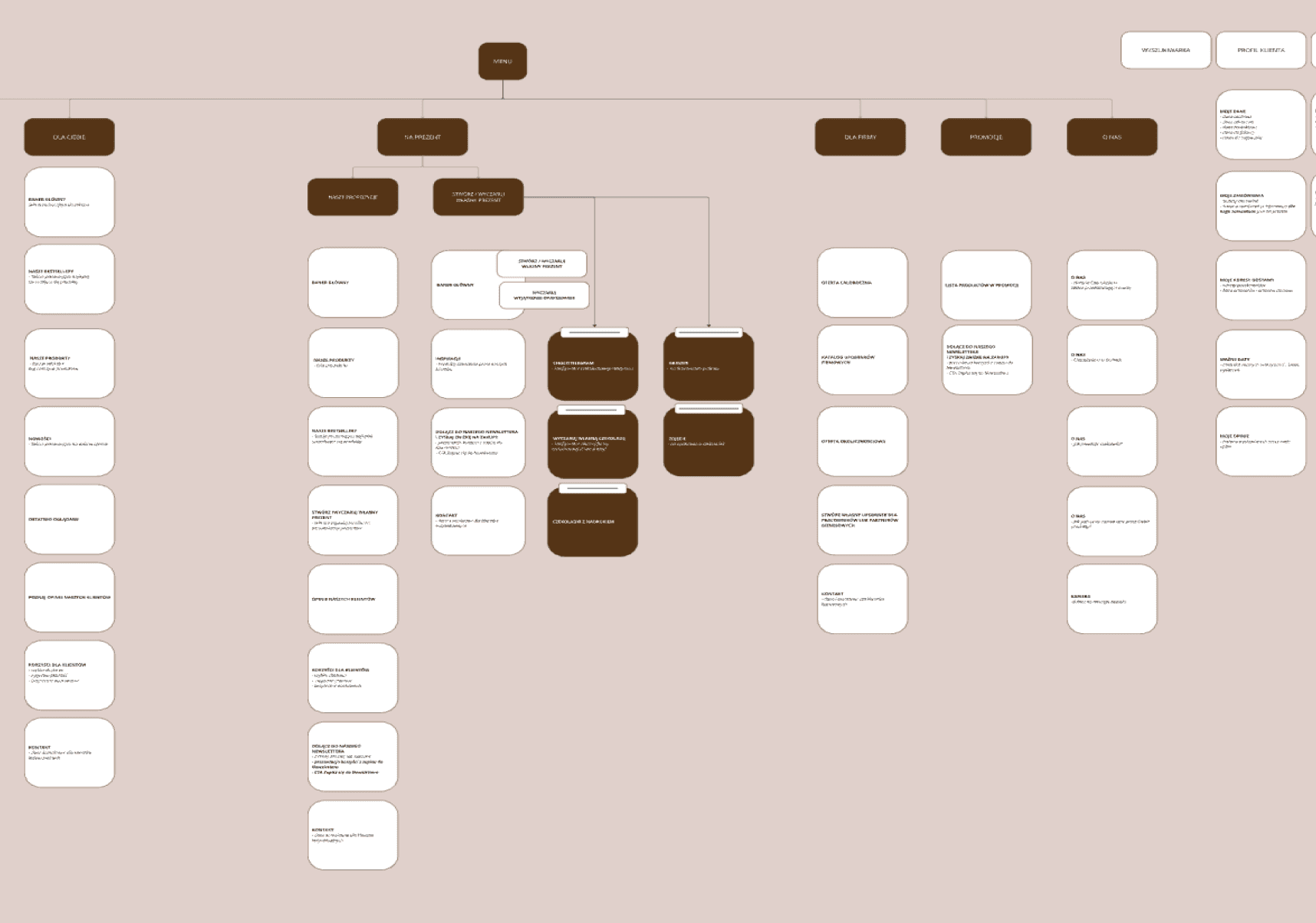
Then, I moved on to UX wireframing, where I started shaping the user experience based on the strategic directions outlined during the client workshops. Although I hadn’t taken part in the sessions myself, I carefully reviewed the materials developed during that phase including inspirational benchmarks and initial business assumptions to make sure my work was grounded in the project’s core vision.
I redesigned the entire e-commerce platform around clearer user flows and a more intuitive information structure, focusing on minimizing friction at every step of the journey. We worked iteratively, reviewing new pieces with the client every week. This close collaboration helped us stay aligned and adjust quickly based on feedback, ensuring that both business and user needs were addressed in each design phase.
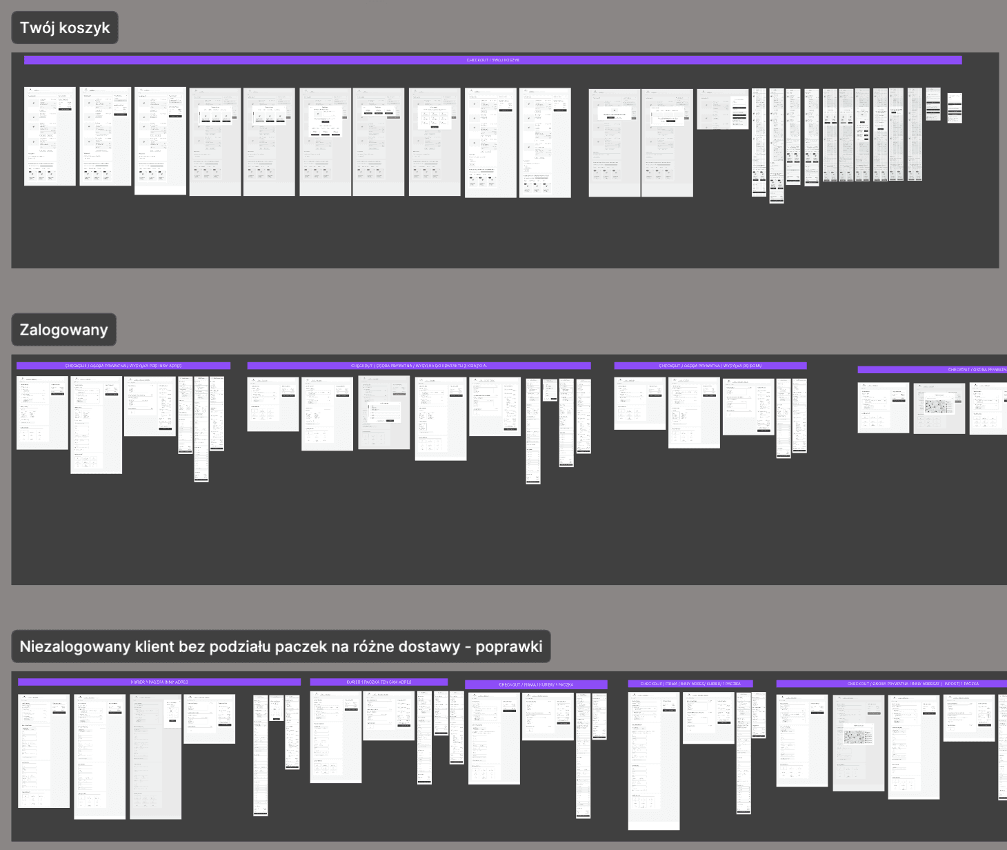
Usability testing
Once the key wireframes were in place, I created a usability testing plan to evaluate how users interacted with our designs in real-life scenarios. Together with my team, we selected five participants from our target group and tested several crucial views including the product page, checkout flow, and chocolate configurator.
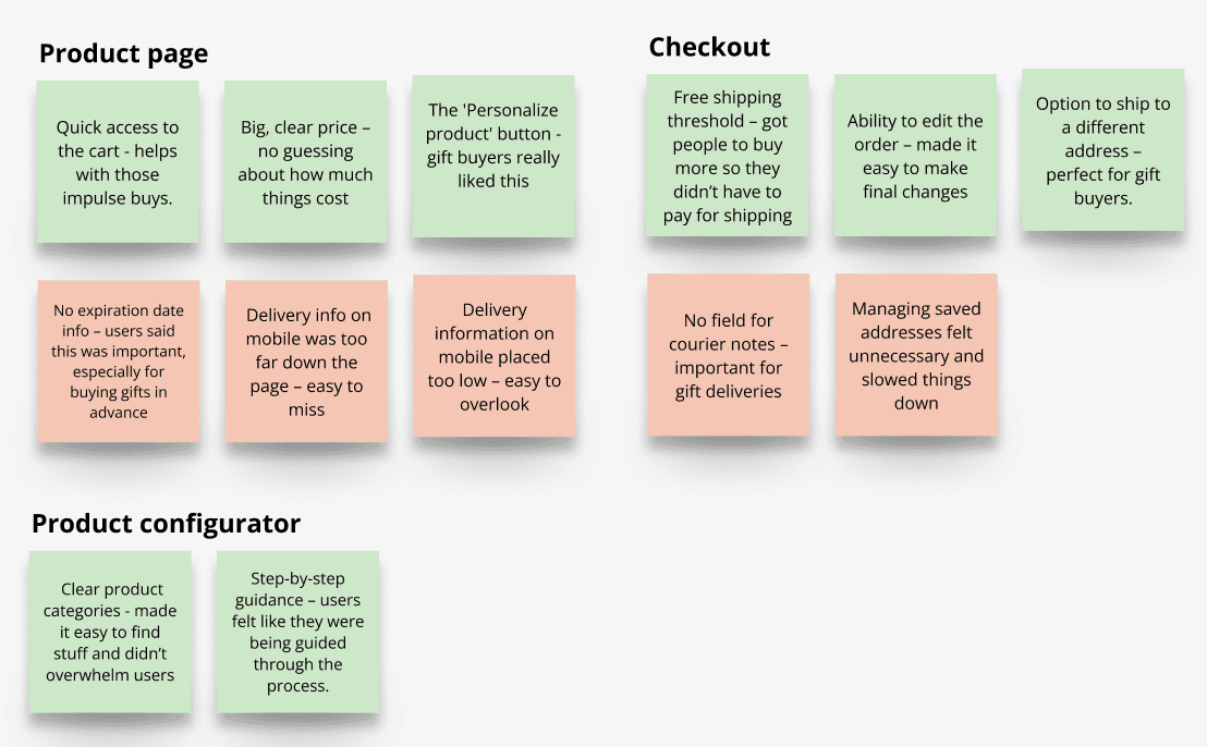
Using moderated sessions and the think-aloud method, we captured honest reactions, friction points, and behavior patterns. This hands-on testing allowed us to quickly identify what was working well like the intuitive personalization flow and what needed improvement, such as missing delivery info or overlooked elements on mobile.
After the sessions, I synthesized the insights and compiled a clear report to guide our next design decisions. These early findings were essential for validating core assumptions and gave us confidence to move forward with features we knew users actually needed and understood.
Iteration
Using insights from usability testing, I made focused updates to the wireframes to tackle key usability issues. But iteration didn’t stop there, each week, I shared progress with the client, gathered feedback, and refined designs in real time.
Weekly reviews helped resolve questions quickly and kept momentum high. Early feedback helped catch issues before they became expensive to fix. Ongoing collaboration built trust and ensured the final design reflected both user needs and business objectives.
he process allowed us to respond to evolving ideas and shifting priorities without losing focus.
Main changes and their impact on usability
Main changes and their impact on usability
Designing new shopping experience
- e-commerce redesign
Home
/
Portfolio
/
Chocolissimo

Client:
Chocolissimo
Industry:
eCommerce
My role:
UX Designer
Time frame:
11/2024 - 03/2025
Data analysis
I kicked things off with data analysis, looking at both the numbers and the customer feedback. Since I hadn’t been part of the original client workshops,
I also took time to review all the materials and insights the team had previously gathered making sure I fully understood the context and user pain points before diving into design.
Screens from Miro board from online workshops.
Chocolissimo - crafting custom chocoalate experience
UX Wireframing
Then, I moved on to UX wireframing, where I started shaping the user experience based on the strategic directions outlined during the client workshops. Although I hadn’t taken part in the sessions myself, I carefully reviewed the materials developed during that phase including inspirational benchmarks and initial business assumptions to make sure my work was grounded in the project’s core vision.
I redesigned the entire e-commerce platform around clearer user flows and a more intuitive information structure, focusing on minimizing friction at every step of the journey. We worked iteratively, reviewing new pieces with the client every week. This close collaboration helped us stay aligned and adjust quickly based on feedback, ensuring that both business and user needs were addressed in each design phase.
UX Wireframing
Once the key wireframes were in place, I created a usability testing plan to evaluate how users interacted with our designs in real-life scenarios. Together with my team, we selected five participants from our target group and tested several crucial views including the product page, checkout flow, and chocolate configurator.
Using moderated sessions and the think-aloud method, we captured honest reactions, friction points, and behavior patterns. This hands-on testing allowed us to quickly identify what was working well like the intuitive personalization flow and what needed improvement, such as missing delivery info or overlooked elements on mobile.
After the sessions, I synthesized the insights and compiled a clear report to guide our next design decisions. These early findings were essential for validating core assumptions and gave us confidence to move forward with features we knew users actually needed and understood.
Using insights from usability testing, I made focused updates to the wireframes to tackle key usability issues. But iteration didn’t stop there — each week, I shared progress with the client, gathered feedback, and refined designs in real time.
Weekly reviews helped resolve questions quickly and kept momentum high.
Early feedback helped catch issues before they became expensive to fix.
Ongoing collaboration built trust and ensured the final design reflected both user needs and business objectives.
he process allowed us to respond to evolving ideas and shifting priorities without losing focus.
Iteration

Visual design
Throughout the entire process,
I collaborated closely with the UI designer to ensure the visual layer reflected both the brand identity and the user needs we uncovered. We synced regularly to align on layout, usability and interaction details -
making sure every element not only looked polished but also served a clear purpose.
Visual design
Throughout the entire process, I collaborated closely with the UI designer to ensure the visual layer reflected both the brand identity and the user needs we uncovered. We synced regularly to align on layout, usability and interaction details - making sure every element not only looked polished but also served a clear purpose.
Client:
Chocolissimo
Industry:
eCommerce
My role:
UX Designer
Time frame:
11/2024 - 03/2025
Goal
A rapidly growing e-commerce platform for personalized chocolate products faced challenges with abandoned shopping carts
and unintuitive navigation, resulting in a low conversion rate. We aimed to optimize user paths and deliver a seamless shopping experience to drive conversions.
My Role
As the lead UX Designer, I was in charge of designing the e-commerce platform. I spent
a lot of time focusing on wireframing and making sure the user flow made sense. My job involved analyzing data, wireframing, planning and running usability tests, and constantly tweaking the designs to improve the user experience.
Data analysis
I kicked things off with data analysis, looking at both the numbers and the customer feedback. Since I hadn’t been part of the original client workshops, I also took time to review all the materials and insights the team had previously gathered making sure I fully understood the context and user pain points before diving into design.
Screens from Miro board from online workshops.
Key UX Pain Points
lots of people were abandoning their carts at checkout
users were dropping out of the product configurator before finishing
mobile users struggling to access subcategories
there was no quick way to reset filters on product listings
people weren’t getting any feedback when they added items to their carts
UX wireframing
Then, I moved on to UX wireframing, where
I started shaping the user experience based on the strategic directions outlined during the client workshops. Although I hadn’t taken part in the sessions myself, I carefully reviewed the materials developed during that phase including inspirational benchmarks and initial business assumptions to make sure my work was grounded in the project’s core vision.
I redesigned the entire e-commerce platform around clearer user flows and a more intuitive information structure, focusing on minimizing friction at every step of the journey. We worked iteratively, reviewing new pieces with the client every week. This close collaboration helped us stay aligned and adjust quickly based on feedback, ensuring that both business and user needs were addressed in each design phase.
Usability testing
Once the key wireframes were in place,
I created a usability testing plan to evaluate how users interacted with our designs in real-life scenarios. Together with my team, we selected five participants from our target group and tested several crucial views including the product page, checkout flow, and chocolate configurator.
Using moderated sessions and the think-aloud method, we captured honest reactions, friction points, and behavior patterns. This hands-on testing allowed us to quickly identify what was working well like the intuitive personalization flow and what needed improvement, such as missing delivery info or overlooked elements
on mobile.
After the sessions, I synthesized the insights and compiled a clear report to guide our next design decisions. These early findings were essential for validating core assumptions and gave us confidence to move forward with features we knew users actually needed and understood.
Iteration
Using insights from usability testing, I made focused updates to the wireframes to tackle key usability issues. But iteration didn’t stop there each week, I shared progress with the client, gathered feedback, and refined designs in real time.
Weekly reviews helped resolve questions quickly and kept momentum high.
Early feedback helped catch issues before they became expensive to fix. Ongoing collaboration built trust and ensured the final design reflected both user needs and business objectives. The process allowed us to respond to evolving ideas and shifting priorities without losing focus.
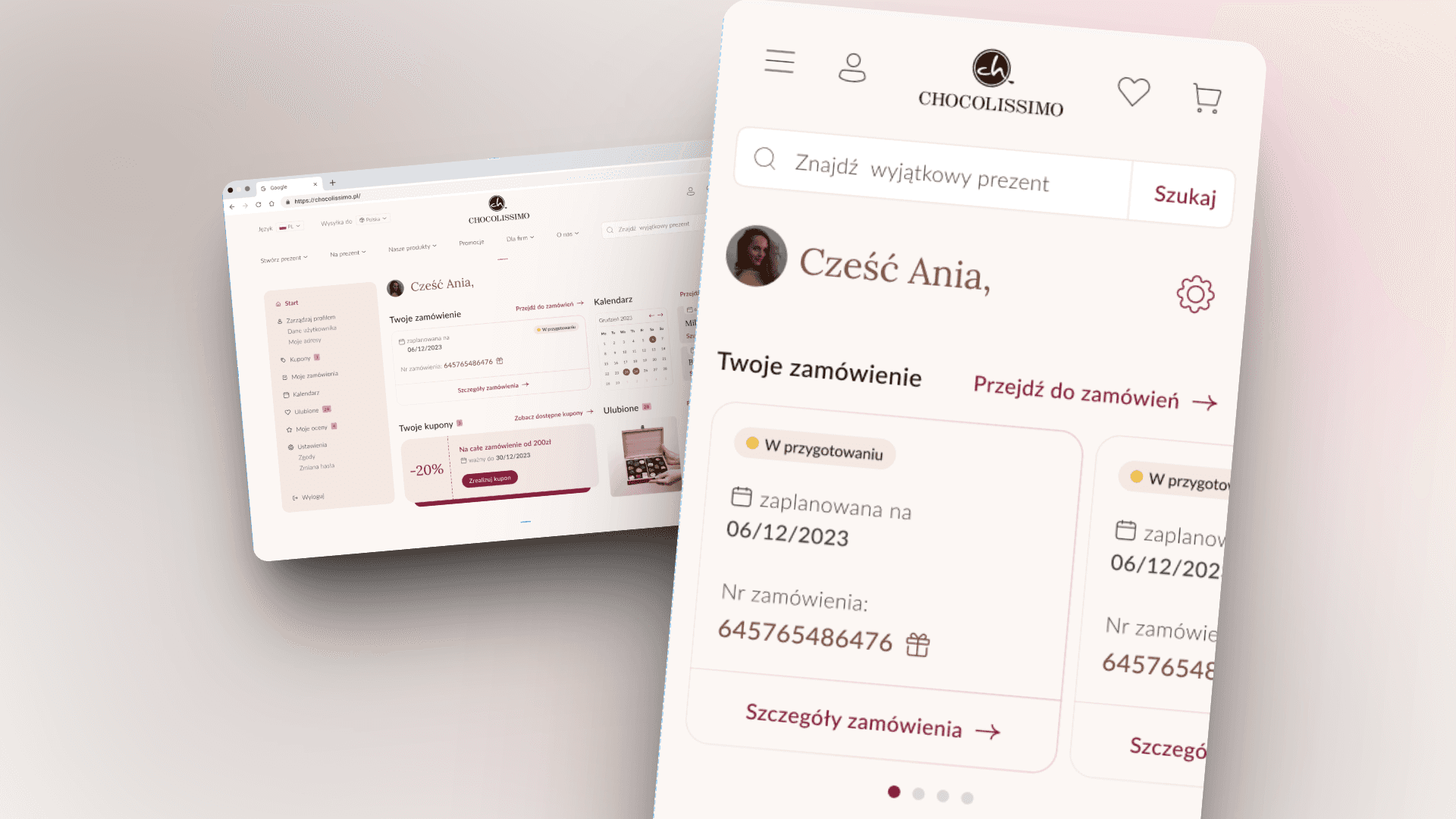
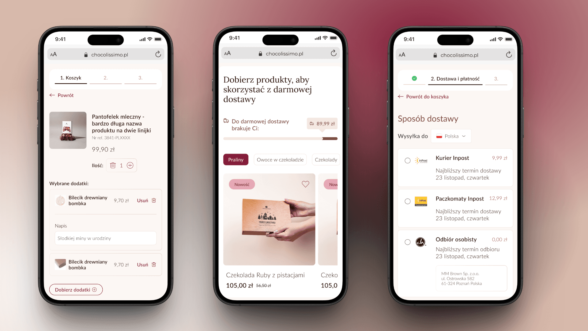
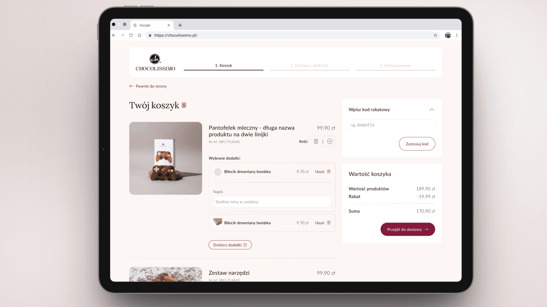
Sticky order summary
Key information (price, items in the cart, available discounts) is always visible, reducing the risk of cart abandonment and increasing the store's transparency.
One-click guest registration
We simplify account creation by adding
a checkbox under the address details, making it effortless for users to sign up. This small change helps boost the number of registered users.
Visible stepper
Helps users track their progress during checkout, reducing uncertainty and improving confidence.
Free shipping progress bar
Encourages users to increase their cart value, as research shows that users prefer to spend more rather than pay for shipping.
Option to ship to a different address
Important for customers buying gifts, allowing them to easily send products directly without manually entering recipient details.
Checkout: Intutive and more efficient shopping process
Checkout: Intutive and more efficient shopping process
Sticky order summary: Key information (price, items in the cart, available discounts) is always visible, reducing the risk of cart abandonment and increasing the store's transparency.
Free shipping progress bar: Encourages users to increase their cart value, as research shows that users prefer to spend more rather than pay for shipping.
Visible stepper: Helps users track their progress during checkout, reducing uncertainty and improving confidence.
One-click guest registration: We simplify account creation by adding a checkbox under the address details, making it effortless for users to sign up. This small change helps boost the number of registered users.
Option to ship to a different address: Important for customers buying gifts, allowing them to easily send products directly without manually entering recipient details.
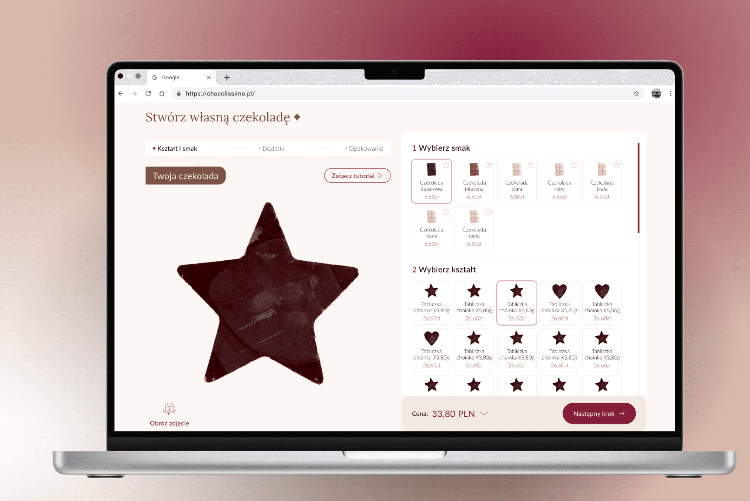
Chocolate configurator: smooth product personalization experience
Three-step flow: I broke it down into three simple stages: pick your flavor, choose a shape, and wrap it up in the perfect packaging. It’s like building your own chocolate masterpiece, but without the mess.
Live configurator: As you make choices, you see the chocolate change right in front of you. This instant visual feedback keeps things exciting and makes the whole experience more interactive.
Always see what's important: I made sure the price and the 'Next' button are always visible, no matter where you are in the process. This keeps things clear and prevents any frustration.
Progress stepper: A progress bar at the top shows you exactly where you are and what's coming next. It keeps you on track and makes the whole process feel organized.
Picture make it easy: Instead of just text, I used pictures for all the options. This makes it super easy to see what you're choosing and find it faster.
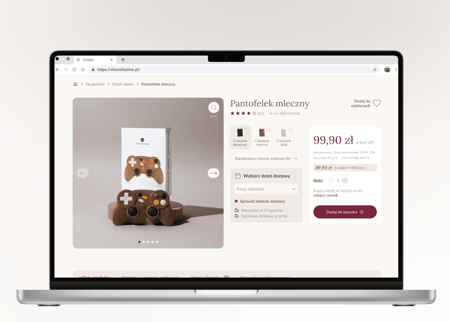
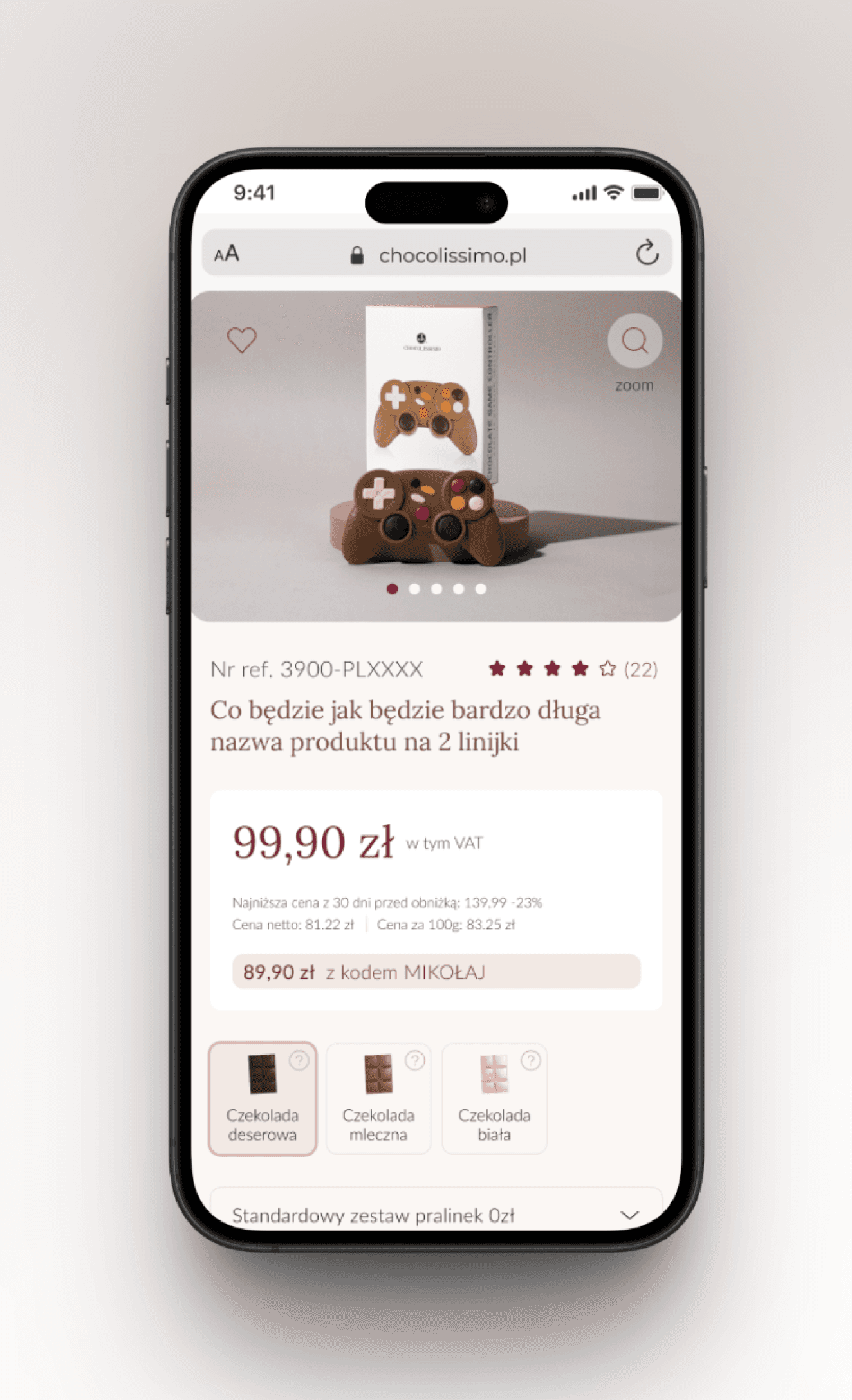
Product page
Visibility of essential information: I put all the important stuff - price, if it's in stock, when it'll arrive, and how many you want right at the top of the page. No scrolling needed.
Brand perks at front and center: I added little messages like 'ships in 24 hours' and 'free delivery over 180 PLN' to remind people why this brand is awesome. It helps nudge them towards buying.
Easy Add-to-cart when scrolling: When you scroll down, a little bar pops up that lets you add the item to your cart without scrolling back up.
Progress stepper: If you're customizing something, we show you where you are in the process. Keeps things clear and easy.
Pictures of choices: Instead of just words, we use pictures for the options. Makes it way easier to see what you're picking and speeds up the whole decision-making thing."
Checkout: Intutive and more efficient shopping process
Sticky order summary: Key information (price, items in the cart, available discounts) is always visible, reducing the risk of cart abandonment and increasing the store's transparency.
Free shipping progress bar: Encourages users to increase their cart value, as research shows that users prefer to spend more rather than pay for shipping.
Visible stepper: Helps users track their progress during checkout, reducing uncertainty and improving confidence.
One-click guest registration: We simplify account creation by adding a checkbox under the address details, making it effortless for users to sign up. This small change helps boost the number of registered users.
Option to ship to a different address: Important for customers buying gifts, allowing them to easily send products directly without manually entering recipient details.
Product page
Visibility of essential information: I put all the important stuff - price, if it's in stock, when it'll arrive, and how many you want right at the top of the page. No scrolling needed.
Brand perks at front and center:
I added little messages like 'ships in 24 hours' and 'free delivery over 180 PLN' to remind people why this brand is awesome. It helps nudge them towards buying.
Easy Add-to-cart when scrolling: When you scroll down, a little bar pops up that lets you add the item to your cart without scrolling back up - super handy.
Progress stepper: If you're customizing something, we show you where you are in the process. Keeps things clear and easy.
Pictures of choices: Instead of just words, we use pictures for the options. Makes it way easier to see what you're picking and speeds up the whole decision-making thing."
Visual design
Throughout the entire process, I collaborated closely with the UI designer to ensure the visual layer reflected both the brand identity and the user needs we uncovered. We synced regularly to align on layout, usability and interaction details - making sure every element not only looked polished but also served
a clear purpose.

Let’s connect


Chocolate configurator: smooth product personalization experience
Three-step flow: I broke it down into three simple stages: pick your flavor, choose a shape, and wrap it up in the perfect packaging. It’s like building your own chocolate masterpiece, but without the mess.
Progress stepper: A progress bar at the top shows you exactly where you are and what's coming next. It keeps you on track and makes the whole process feel organized
Live configurator: As you make choices, you see the chocolate change right in front of you. This instant visual feedback keeps things exciting and makes the whole experience more interactive.
Always see what's important:
I made sure the price and the 'Next' button are always visible, no matter where you are in the process. This keeps things clear and prevents any frustration
Picture make it easy: Instead of just text, I used pictures for all the options. This makes it super easy to see what you're choosing, so you can pick your perfect chocolate with confidence.
Product page
Visibility of essential information: I put all the important stuff - price, if it's in stock, when it'll arrive, and how many you want right at the top of the page. No scrolling needed.
Brand perks at front and center:
I added little messages like 'ships in 24 hours' and 'free delivery over 180 PLN' to remind people why this brand is awesome. It helps nudge them towards buying.
Easy Add-to-cart when scrolling: When you scroll down, a little bar pops up that lets you add the item to your cart without scrolling back up. Super handy.
Progress stepper: If you're customizing something, we show you where you are in the process. Keeps things clear and easy.
Pictures of choices: Instead of just words, we use pictures for the options. Makes it way easier to see what you're picking and speeds up the whole decision-making thing.